

I’ve just been working on the summary reports for the pomVLAD project. We are reporting five enhanced recovery recommendations and to make it easy for sites to see how they are performing I wanted to produce gauges similar to these:
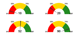
I’d made some example gauges on the infographic website Venngage, where I colour coded the fill based on the percentage (pink 0-59%, orange 60-79%, green 80-100%). In order to declutter the charts I removed any labels around the edges and didn’t want to have a tick mark for the percentage achieved. Here’s the example created on Venngage:

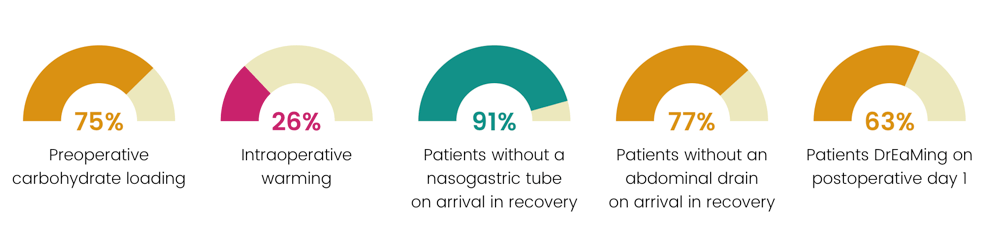
This looks much cleaner than the first example. The colour coded gauge fill and percentage figure allows immediate interpretation, the only problem is that it’s not achievable to produce reports for 10 hospitals manually, cue R, ggplot2 and RMarkdown.
I’ve spent the past 18 months learning R programming to automate the production of the Perioperative Quality Improvement Programme (PQIP) quarterly reports, and have spent a lot of that time producing and tweaking graphs to try and make them interesting, easily interpretable, and useful for local teams. So here’s the plot created in ggplot2 (after several hours of coding, tweaking, rerunning etc.):
 A pretty good match for the infographic above, here’s the code used to create the plot:
ggplot(df, aes(fill = group, ymax = percentage, ymin = 0, xmax = 2, xmin = 1)) +
 geom_rect(aes(ymax=1, ymin=0, xmax=2, xmin=1), fill ="#ece8bd") +
 geom_rect() +
 coord_polar(theta = "y",start=-pi/2) + xlim(c(0, 2)) + ylim(c(0,2)) +
 geom_text(aes(x = 0, y = 0, label = label, colour=group), size=6.5, family="Poppins SemiBold") +
 geom_text(aes(x=1.5, y=1.5, label=title), family="Poppins Light", size=4.2) +
 facet_wrap(~title, ncol = 5) +
 theme_void() +
 scale_fill_manual(values = c("red"="#C9146C", "orange"="#DA9112", "green"="#129188")) +
 scale_colour_manual(values = c("red"="#C9146C", "orange"="#DA9112", "green"="#129188")) +
 theme(strip.background = element_blank(),
 strip.text.x = element_blank()) +
 guides(fill=FALSE) +
 guides(colour=FALSE)
Example dataframe:
df <- data.frame(matrix(nrow=5, ncol = 2))

names(df) <- c("variable", "percentage")
df$variable <- c("Carbohydrates", "Warming", "NGTnotPresent", "DrainNotPresent", "DrEaMing")
df$percentage <- c(0.67,0.33,0.86,0.78,0.58)

df <- df %>% mutate(group=ifelse(percentage <0.6, "red",
 ifelse(percentage>=0.6 & percentage<0.8, "orange","green")),
 label=paste0(percentage*100, "%"),
 title=dplyr::recode(variable, `Carbohydrates`="Preoperative\ncarbohydrate loading",
 `Warming`="Intraoperative\nwarming",
 `NGTnotPresent`="Patients without a\nnasogastric tube\non arrival in recovery",
 `DrainNotPresent`="Patients without an\nabdominal drain\non arrival in recovery",
 `DrEaMing`="Patients DrEaMing on\npostoperative day 1"))


How do you round off the values so that you just have a two digit percentage value? Ex. .91343234 to 91% without getting 91.343234%.
Here is my code:
ggplot(dft2, aes(fill = group, ymax = Current, ymin = 0, xmax = 2, xmin = 1)) +
geom_rect(aes(ymax=1, ymin=0, xmax=2, xmin=1), fill =”#ece8bd”) +
geom_rect() +
coord_polar(theta = “y”,start=-pi/2) + xlim(c(0, 2)) + ylim(c(0,2)) +
geom_text(aes(x = 0, y = 0, label = label, colour=group), size=12, family=”Poppins SemiBold”) +
geom_text(aes(x=1.5, y=1.5, label=Current), family=”Poppins Light”, size=4) +
theme_void() +
scale_fill_manual(values = c(“red”=”#C9146C”, “orange”=”#DA9112”, “green”=”#129188”)) +
scale_colour_manual(values = c(“red”=”#C9146C”, “orange”=”#DA9112”, “green”=”#129188”)) +
theme(strip.background = element_blank(),
strip.text.x = element_blank()) +
guides(fill=FALSE) +
guides(colour=FALSE)
LikeLike
Nevermind, I solved my own problem by using the round() function when I grouped it:
dft2 % mutate(group=ifelse(Current=0.6 & Current<0.8, "orange","green")), label = paste0(round(Current, 2)*100, "%"))
LikeLike
learning ggplot2, very good example, thank you ♡♡
LikeLike
I was looking for a way to do this in ggplot and this was still the best resource I could find!
That said, I’d make one adjustment (in case anyone else stumbels here): instead of using `coord_polar()`, I would use `coord_radial()` so you don’t have the blank bottom of the grid:
“`
# Add an end point, expand=FALSE, and change the upper limit of y to 1
coord_radial(theta = “y”, start=-pi/2, end = pi/2, expand = FALSE) + xlim(c(0, 2)) + ylim(c(0,1))
“`
LikeLike